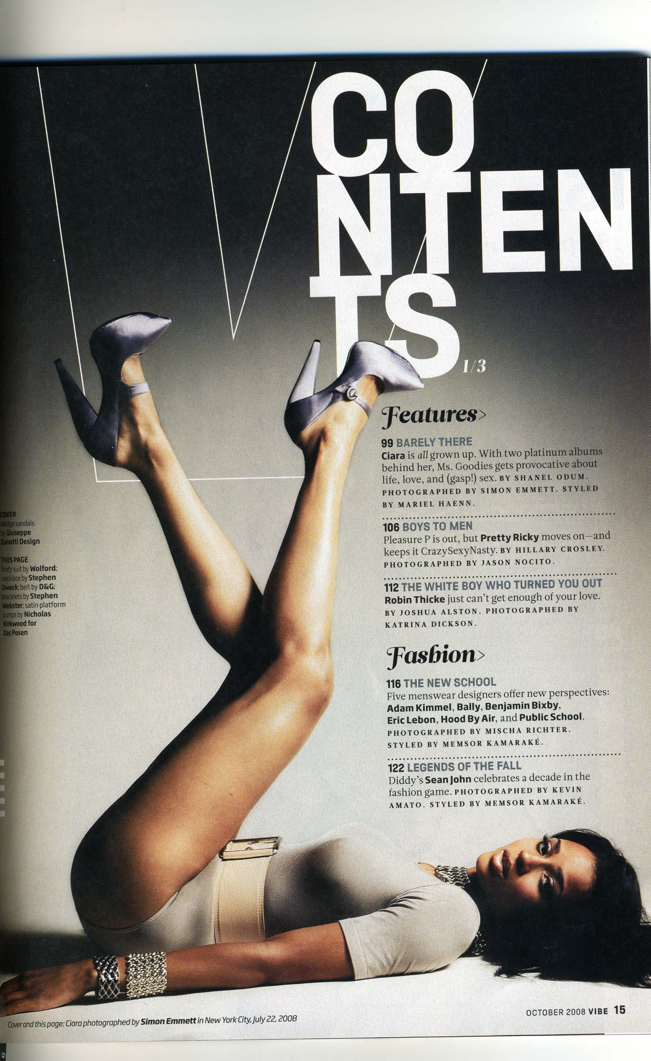
The masthead is abbreviated by the simple outline of the 'v' therefore it doesn't take up a lot of the page however is noticeable and states the magazines masthead clearly in a clever way. it is also the reinforced by the shape of the models legs as it is also a v shape created. the arrangement of the masthead is slightly jumbled and therefore is effective as it means you read into it more.
The layout is very smart and it is organised as the contents are categorised they are split into several storys, the model fits perfectly in line with the text and the text is arranged around her body shape this means that the magazine contents is all together clearer as nothing is overlapped.
The colour skeme is good and uses shades rather than different block colours this adds good effect as it gives the contents a 3D effect, as shown as the model is wearing colours that goes with the theme of the contents page, even the models hair is a very dark colour therefore creating a flow in the magazine as a whole.
The font is appropriate as different fonts are used for the section titles compared with the coverlines and there description. They are very effective for the genre as they are all in caps and therefore stand out. Also the names of any artists are in bold therefore indicating that they are important and drawing attention .
No comments:
Post a Comment