
Tuesday, 16 October 2012
Thursday, 11 October 2012
research and planning- contents page analysis
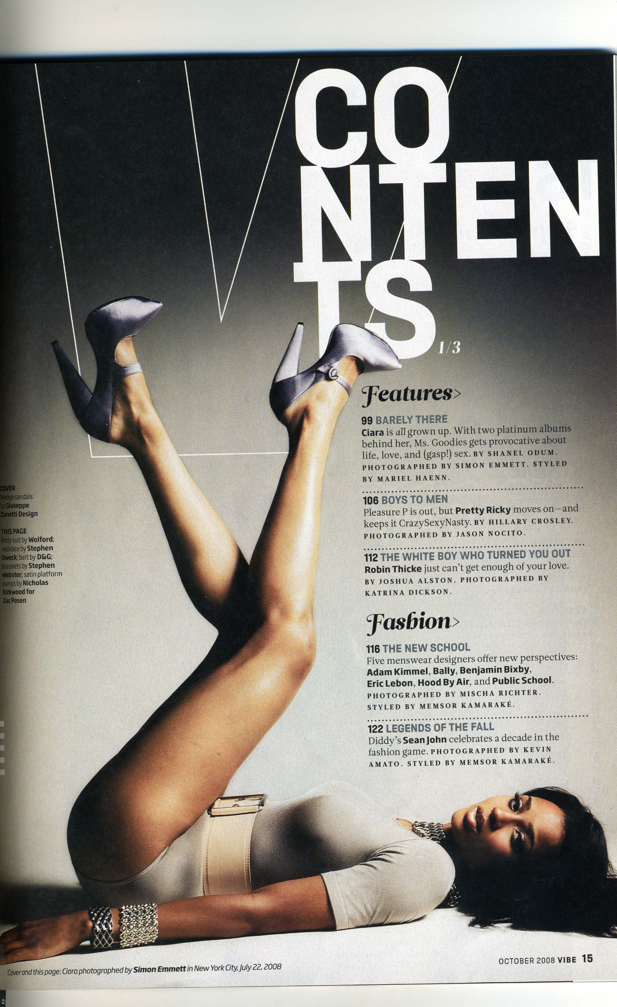
The masthead is abbreviated by the simple outline of the 'v' therefore it doesn't take up a lot of the page however is noticeable and states the magazines masthead clearly in a clever way. it is also the reinforced by the shape of the models legs as it is also a v shape created. the arrangement of the masthead is slightly jumbled and therefore is effective as it means you read into it more.
The layout is very smart and it is organised as the contents are categorised they are split into several storys, the model fits perfectly in line with the text and the text is arranged around her body shape this means that the magazine contents is all together clearer as nothing is overlapped.
The colour skeme is good and uses shades rather than different block colours this adds good effect as it gives the contents a 3D effect, as shown as the model is wearing colours that goes with the theme of the contents page, even the models hair is a very dark colour therefore creating a flow in the magazine as a whole.
The font is appropriate as different fonts are used for the section titles compared with the coverlines and there description. They are very effective for the genre as they are all in caps and therefore stand out. Also the names of any artists are in bold therefore indicating that they are important and drawing attention .
Tuesday, 9 October 2012
Tuesday, 2 October 2012
research and planning- analysis of magazine cover


These are obviously a pop magazine as the mastheads are "we love pop". Also the cover lines are all related to pop artists. The font is curved and bold suggesting it is also pop related.
The target audience is clearly shown as teenage girls as it has pink as its main colour and the cover lines include 'how to pull a pop star' and the slogan of the magazine is "gossip, fashion and boys" three of the main things that tie in with young teenage girls . The posters included are all of males therefore suggesting a female audience, the type of language used is in association we young people as words like "uh-oh", "pull" and "twit-twoo" are used in order to connect with the target auidence.
The layout of the page is very scattered therefore giving the viewer no place to directly look, this means they have to stop and take a closer look at the magazine to gather all the information on display. Also the cover lines are all big and bold and therefore all stand out. This magazine cover follows the three colour rule, the main colour being pink which is known to be a girls colour.
The models is are big teenage role models, Jessie J is currently one of the biggest female artists in pop music and little mix are the new and upcoming girl band from the talent show xfactor and therefore with the big smile on all there faces they signify how happy they all are, this encourages girls to buy the magazine. The fact that the models are seen as icons means that the way they dress will be looked at in inspiration to young girls therefore the medium long shot is always used as it shows not to much of the model/s but also just enough to give girls a look in on how celebrity's are currently dressing in and the new trends that will be being set this fits in with the magazine really well.
research and planning- masthead designs

Subscribe to:
Posts (Atom)